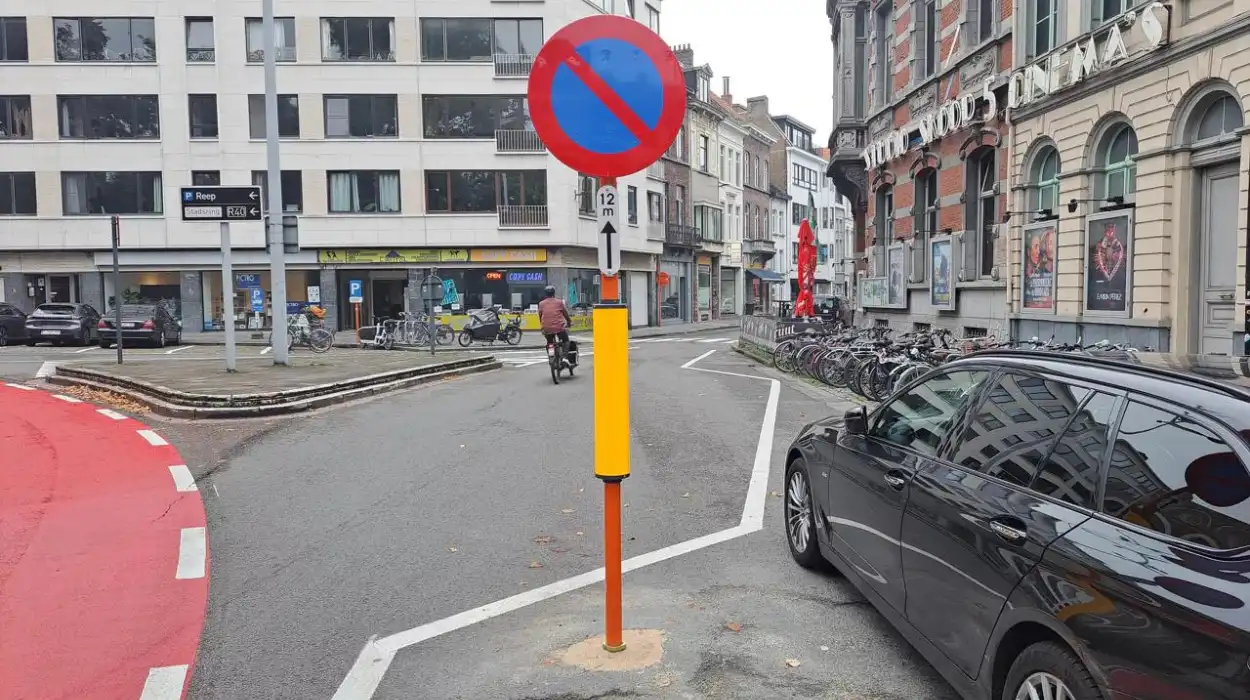
Ghent (The Brussels Morning Newspaper): The Ghent’s Sint-Annaplein roundabout now has bright red bike lanes, but zigzag lines and bumps are confusing cyclists. The city says these markings are intentional for future improvements.
The recent changes to the Sint-Annaplein roundabout have made some clear updates to the road markings to keep cyclists safer. The bike lanes are now a bright red color to make them easier to see, which is a usual way to highlight bike paths. However, some cyclists are confused by the new markings that have zigzag lines and round bumps along the bike lanes.
What are the implications of the new zigzag road markings and design changes at Sint-Annaplein for cyclists and local drivers?
The zigzag lines are to help guide cyclists or show changes in the bike lane, while the round bumps warn about areas where they need to be careful or where the road changes. Even though these markings are meant to make the bike path clearer and safer. It has been said that they might be confusing for people who are used to the old layout. The different patterns are designed to meet specific traffic needs, but not everyone might understand their purpose right away.
The recent changes to the Sint-Annaplein were made to make it safer for cyclists. They kept only one of the original two lanes for cars and repainted the parking lanes to make parking better organized. One new road marking has a zigzag pattern and is located next to the parking spaces and a bike rack. Local shop owners are worried about the new design, especially about how clear and safe it is. The zigzag line, along with a no-parking sign that is placed more than two meters away from the sidewalk, is confusing. Shop owners mentioned that this setup can make it hard for drivers who are not used to the new layout, especially when they are turning. The sign’s position can block their view and make it difficult to maneuver, which could lead to dangerous situations.
The city has responded to concerns about the strange road markings at Sint-Annaplein, saying that these designs are intentional and not mistakes. Filip Watteeuw, who is in charge of mobility, explained that the unusual shapes are part of a larger plan. They are designed to make room for future things like benches, flower boxes, and bike racks that will be added later. Watteeuw mentioned that while the markings might look odd now, they are made to fit well with future furniture and improvements. This plan ensures that everything will work well together and look good once the project is complete.


